I'm exploring ideas about visualizing Postgres query plans. There are a few existing visualizations like depesz's colorized tables, pg_flame's flame graphs, and pganalyze's tree view, but there's so much information in a plan that doesn't make it into these visualizations. I want to see more. I want an intuitive—maybe even fun—picture of what the imaginary world of the these internal processes looks like.
pg_flame's Flame graphs perhaps come the closest to what I'm looking for, but flame graphs are ordered on the x-axis alphabetically. A flame chart, in contrast, orders the x-axis by time, a property it shares with timeline charts, like the one in Chrome's network tab. This appeals to me. It's almost like a waveform of a sound recording. That seems like a useful analog...
I would also like to make use of the y-axis. Flame graphs/charts make each item equally sized on the y-axis. This feels like a wasted opportunity. Why not maximize the information content of every dimension? You don't get very many of them.
This lead me to the idea of representing each node of the query plan as the shape of the data it's working with: rows and their widths. I.e., rectangles. It could look like a bunch of little tables processing in parallel and merging together over time. As they pass through the time axis, they sort of "extrude" into 3D boxes. If the box is tall, it has a lot of rows. If it's wide, well, the rows are wide (maybe many columns, or wide data in them). If it's deep, it is being worked on for a long time.
And here's what I was able to cook up in a fairly short amount of time:
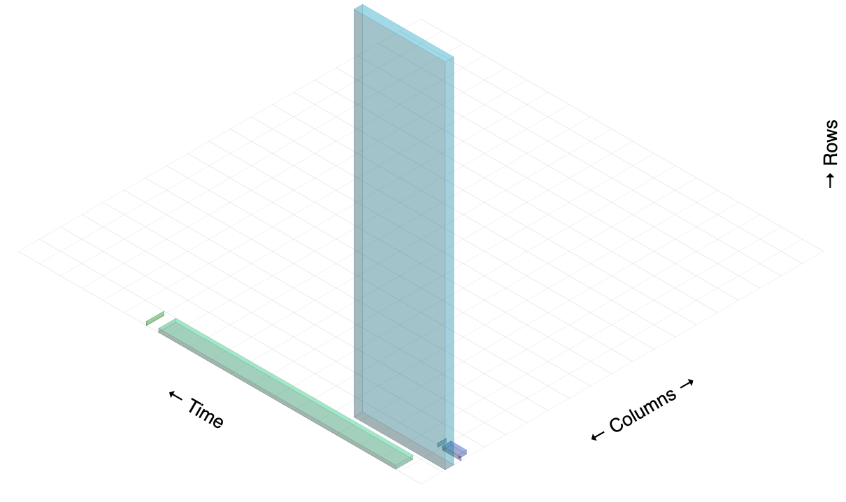
I'm using Isomer to draw them on an HTML5 canvas.
It's a bit disorienting because the boxes aren't labeled, but you can hopefully get a rough idea of how they correspond to the nodes in the example query plan based on each node's rows, width, and actual time. From left to right, here is what each box corresponds to:
- Sort (cost=717.34..717.59 rows=101 width=488) (actual time=7.761..7.774 rows=100 loops=1)
- Hash Join (cost=230.47..713.98 rows=101 width=488) (actual time=0.711..7.427 rows=100 loops=1)
- Seq Scan on tenk2 t2 (cost=0.00..445.00 rows=10000 width=244) (actual time=0.007..2.583 rows=10000 loops=1)
- Hash (cost=229.20..229.20 rows=101 width=244) (actual time=0.659..0.659 rows=100 loops=1)
- Bitmap Heap Scan on tenk1 t1 (cost=5.07..229.20 rows=101 width=244) (actual time=0.080..0.526 rows=100 loops=1)
- Bitmap Index Scan on tenk1_unique1 (cost=0.00..5.04 rows=101 width=0) (actual time=0.049..0.049 rows=100 loops=1)
Here is the raw EXPLAIN ANALYZE output being used:
                                                                 QUERY PLAN
--------------------------------------------------------------------------------------------------------------------------------------------
 Sort  (cost=717.34..717.59 rows=101 width=488) (actual time=7.761..7.774 rows=100 loops=1)
   Sort Key: t1.fivethous
   Sort Method: quicksort  Memory: 77kB
   ->  Hash Join  (cost=230.47..713.98 rows=101 width=488) (actual time=0.711..7.427 rows=100 loops=1)
         Hash Cond: (t2.unique2 = t1.unique2)
         ->  Seq Scan on tenk2 t2  (cost=0.00..445.00 rows=10000 width=244) (actual time=0.007..2.583 rows=10000 loops=1)
         ->  Hash  (cost=229.20..229.20 rows=101 width=244) (actual time=0.659..0.659 rows=100 loops=1)
               Buckets: 1024  Batches: 1  Memory Usage: 28kB
               ->  Bitmap Heap Scan on tenk1 t1  (cost=5.07..229.20 rows=101 width=244) (actual time=0.080..0.526 rows=100 loops=1)
                     Recheck Cond: (unique1 < 100)
                     ->  Bitmap Index Scan on tenk1_unique1  (cost=0.00..5.04 rows=101 width=0) (actual time=0.049..0.049 rows=100 loops=1)
                           Index Cond: (unique1 < 100)
The one thing I like best about this visualization is how it shows the flow of work over time. Some of that involves a bit of deduction (which may not even be correct) because Postgres only tells you when the node's first and last rows are emitted, and not when the node actually began work.
This was a fun experiment, but I eventually came to the opinion that 3D visualizations are rare for good reasons: They're harder to make (than 2D), they're hard to view (background data is obscured by foreground data, or you need full-on 3D rendering with a moveable camera, but that's disorienting), and they fit awkwardly into web pages. And it's a lonely world: There seems to be a dearth of libraries designed for this purpose. When you want to do something no one else is doing, you might be a pioneer, or you might just be lost.
There are still more things I would like to try, like adding text labels, and showing the flow of data between nodes. I still want to continue this exploration... but probably in 2D.
The (messy) code is here on github.
Nick Welch <nickwelch.dev@gmail.com> · github